UX/UI CASE STUDY - 2026
REWIRED
A conference brand and website about how technology frames reality.
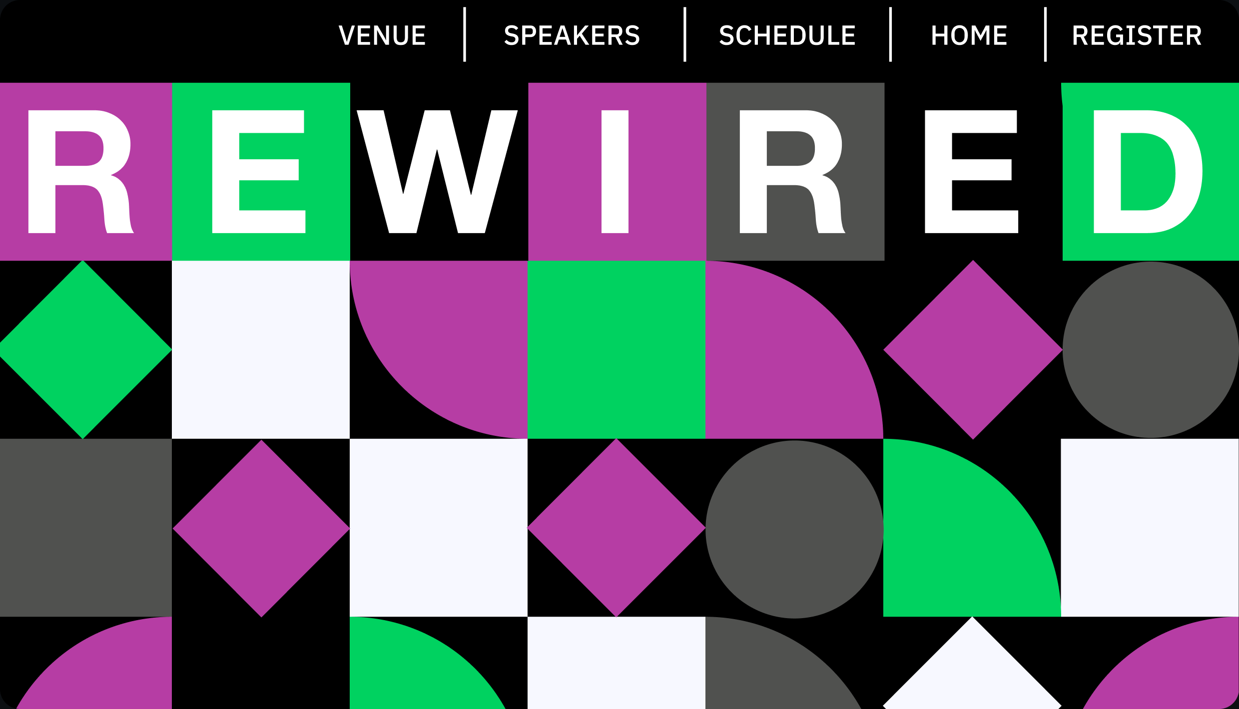
- Role
- Solo Designer
- Tools
- Figma, Illustrator
- Project
- Brand + Website
- Timeline
- Spring 2026
01 - The brief
Invent a conference. Make it feel real.
The brief was to invent a TED-style conference and build its whole identity, from print to screen. I chose a topic I care about: UX/UI shapes our attention every day, and most people never notice.
02 - Research
Eight talks, one question.
I studied TED talks from eight speakers, from Tristan Harris on distraction to Daniel Engber on the progress bar. One question kept coming up: who is technology really working for?
03 - Meet the audience
Designers who want to do better.
Rewired is for people already in the field, the kind of crowd that goes to Figma’s Config.
THE ATTENDEE
Tyler, 23
New UI/UX intern at a major company
He wants to learn how to improve UI, and how to make the UX of the products he works on even better.
WHO IT’S FOR
Curious and critical
Ages 22–38 · Bay Area and West Coast tech
04 - Finding the concept
Six names, three moods.
I wrote six concept directions and chose Rewired. Before landing there, I tested three type and color moods for Framed, and gave each one an honest reaction.
01
Designed Against You
The interface was never built for you.
02
Hooked By Design
You’re addicted. You’re the target.
03
Framed
Reality is mediated. The question is by whom.
04
The Invisible Interface
The most powerful design is the kind you never notice.
05
The Algorithm and Us
You didn’t choose what you see. It chose for you.
06 · CHOSEN
Rewired
Technology didn’t just change what we do. It changed how we think.
FRAMED
Helvetica Neue
A - Clean
“Looks like it was built by the company it’s criticizing.”
FRAMED
Space Mono
B - Glitch
“Very glitchy, very cool, yup!”
FRAMED
DM Sans
C - Corporate
“How corporate!”
05 - From glitch to system
Breaking it, then building it.
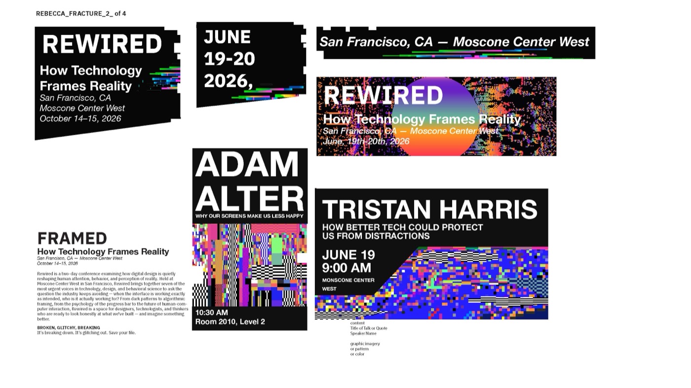
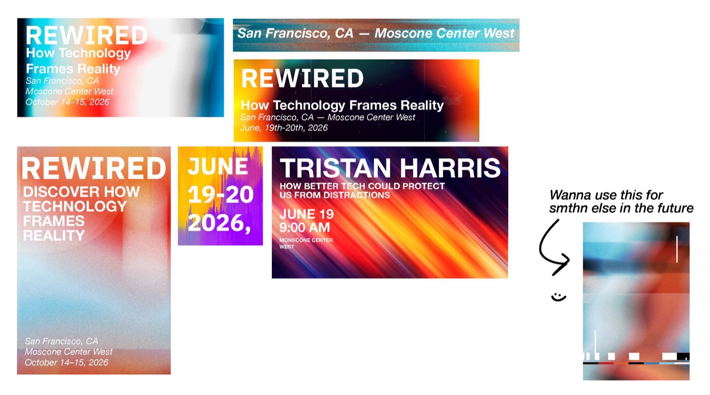
My first toolkits leaned on glitch effects. They fit the topic, but read as broken. I moved to a grid of simple shapes instead: building blocks, like the fundamentals of UI design.
06 - The system
Foundational. Systematic. Precise.
Five colors, one typeface, and a pattern built from four shapes. The mood: urgent, critical, built.
COLOR + TYPE
Helvetica Neue
Regular, Bold and Light, for everything.
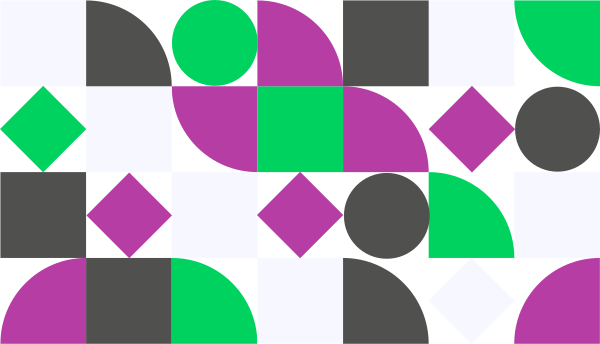
Logo + pattern
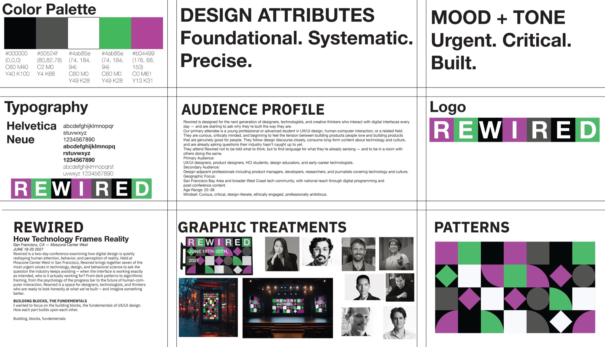
The full toolkit
07 - Structure first
Five pages, one goal: register.
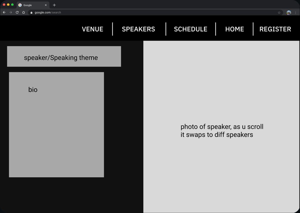
Before any styling, I mapped the site and blocked out pages in grey boxes. Every page links back to Register.
SITEMAP
08 - The website
The part I loved most.
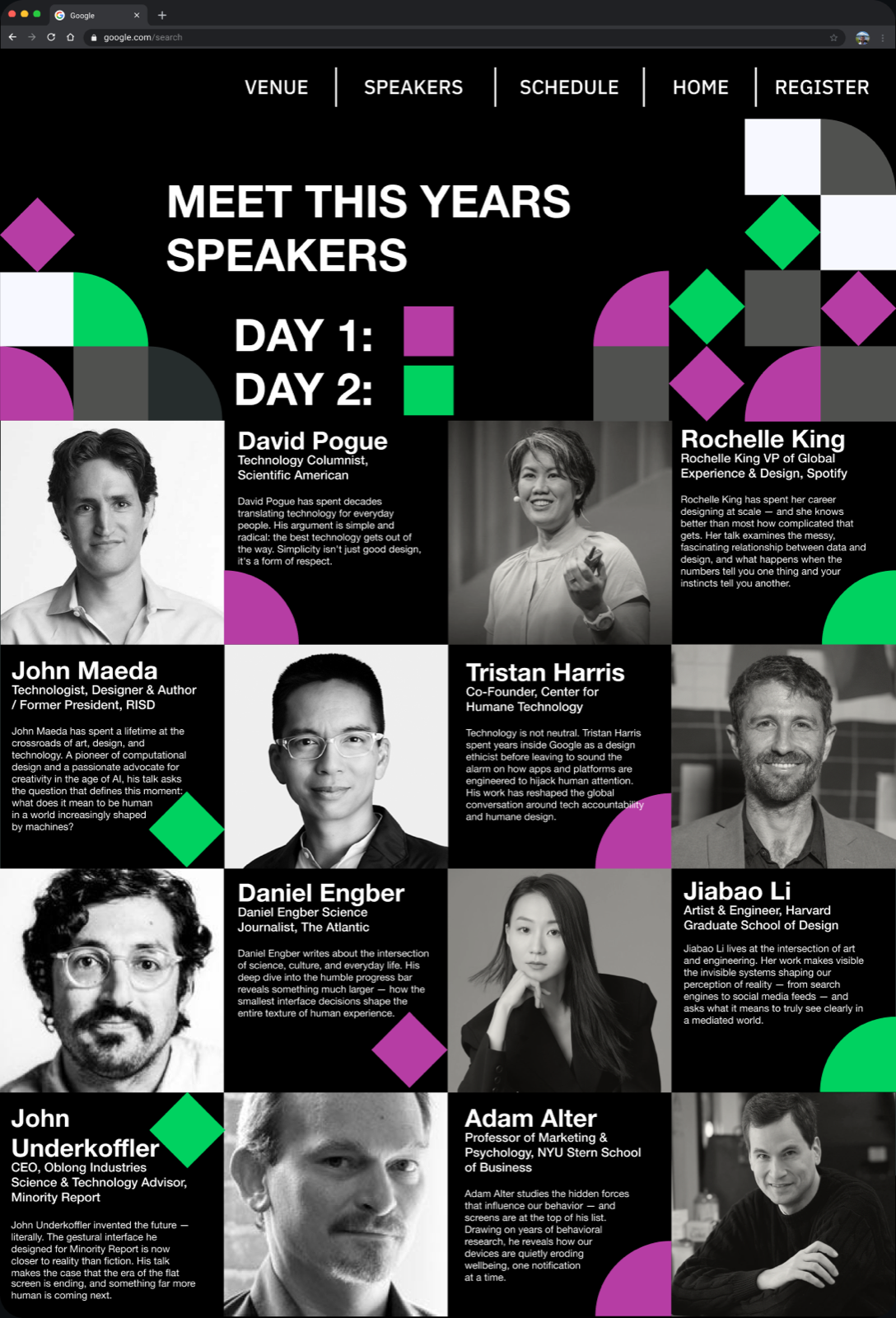
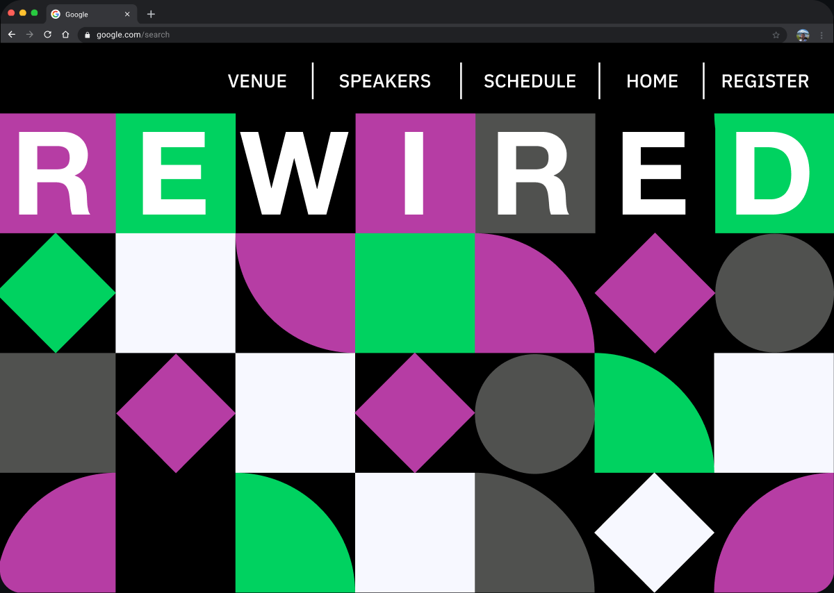
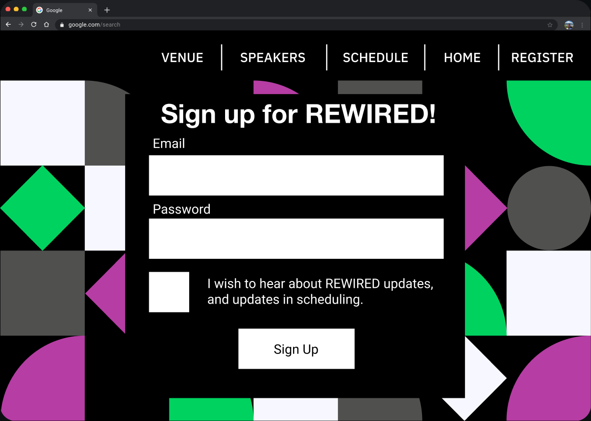
The pattern frames every page, so the brand carries from print to screen. The speakers page leads with faces, names and one-line talk descriptions, and each day has its own color.
09 - What changed
From glitch to grid.
Early screens used a busy glitch background behind the content. Swapping in the shape pattern made the pages calmer, easier to read, and part of one system.
BEFORE
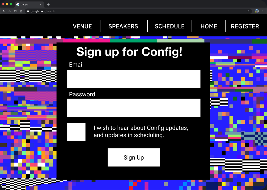
Glitch background fights the form.
AFTER
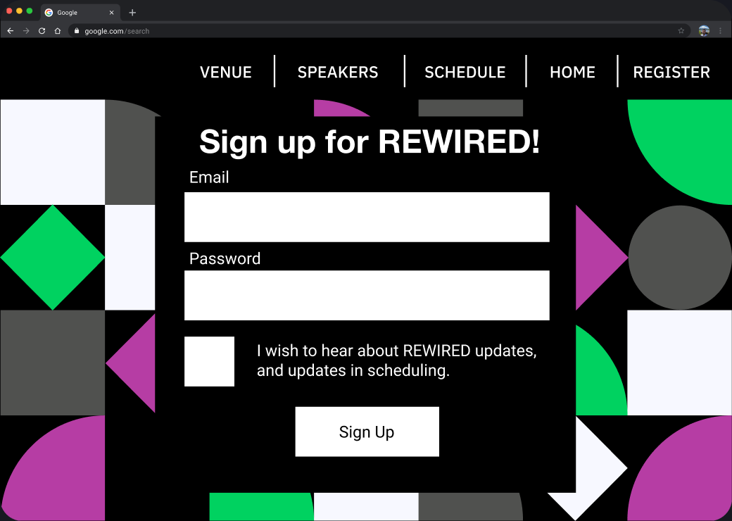
The pattern frames the form instead.
10 - Beyond the screen
One system, every touchpoint.
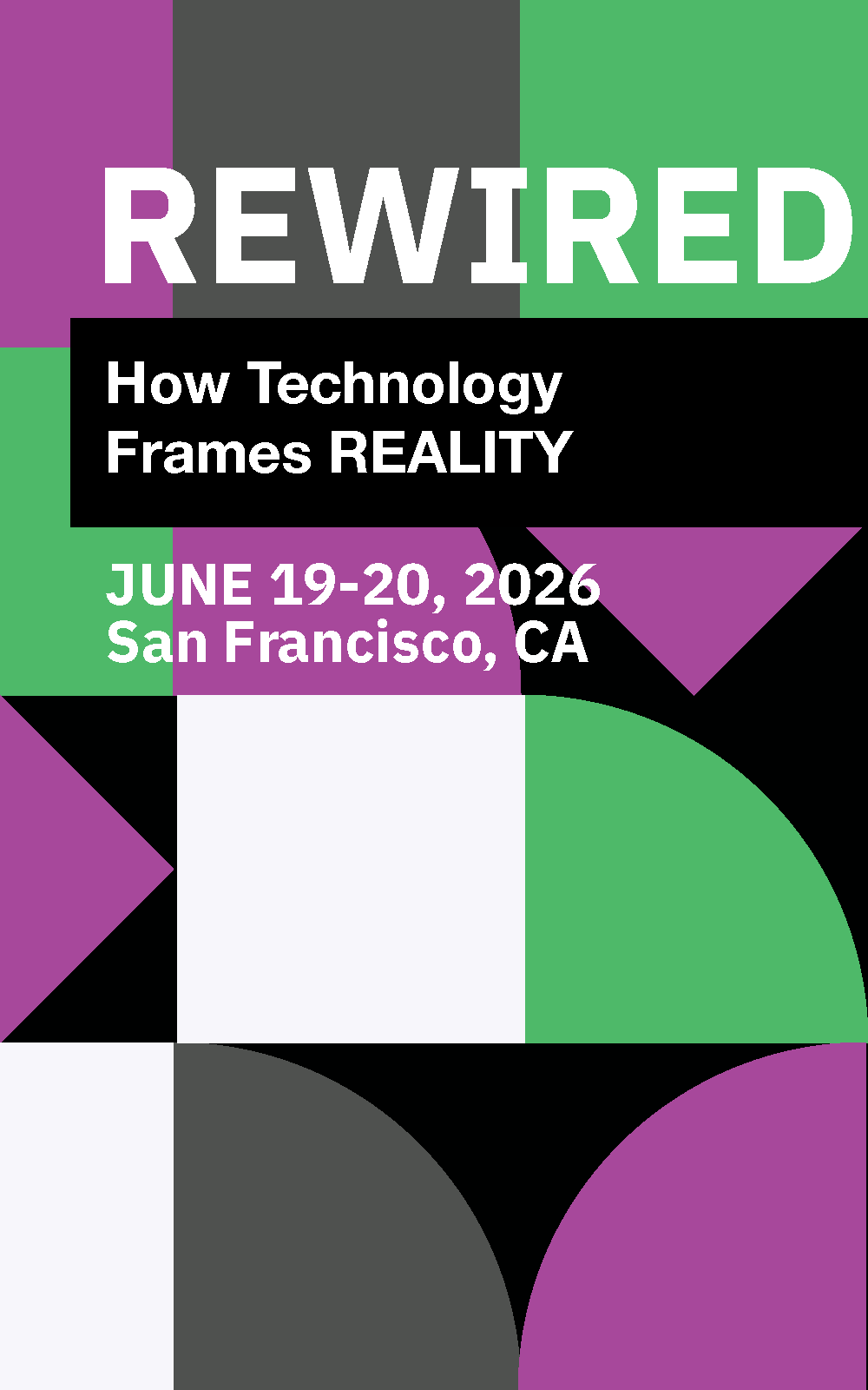
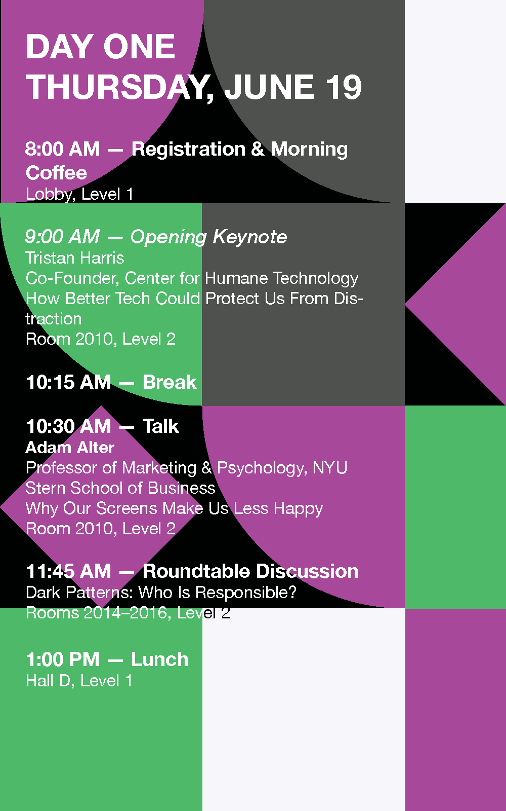
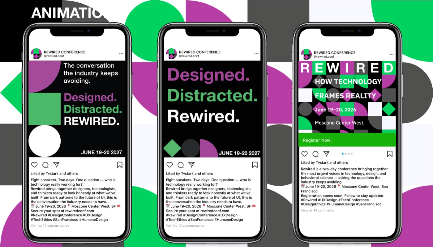
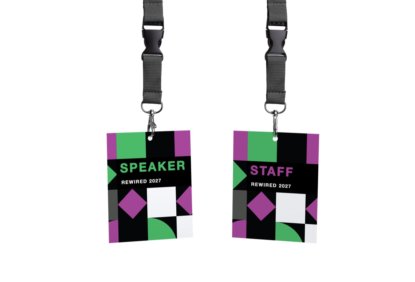
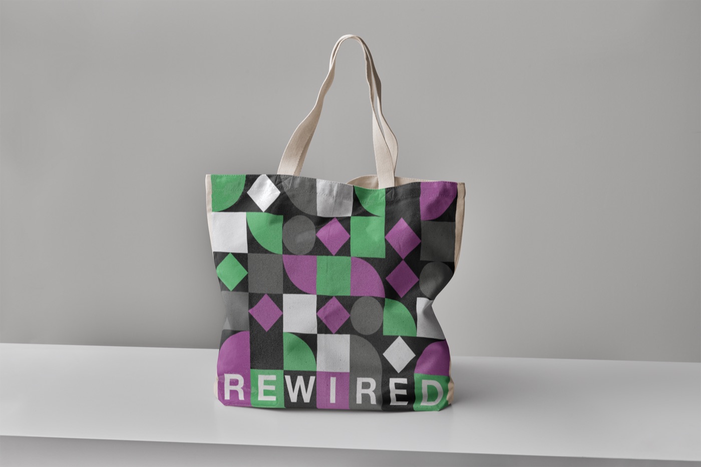
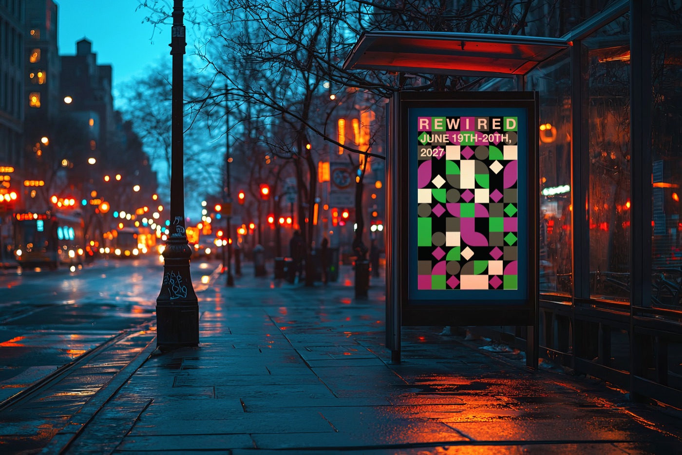
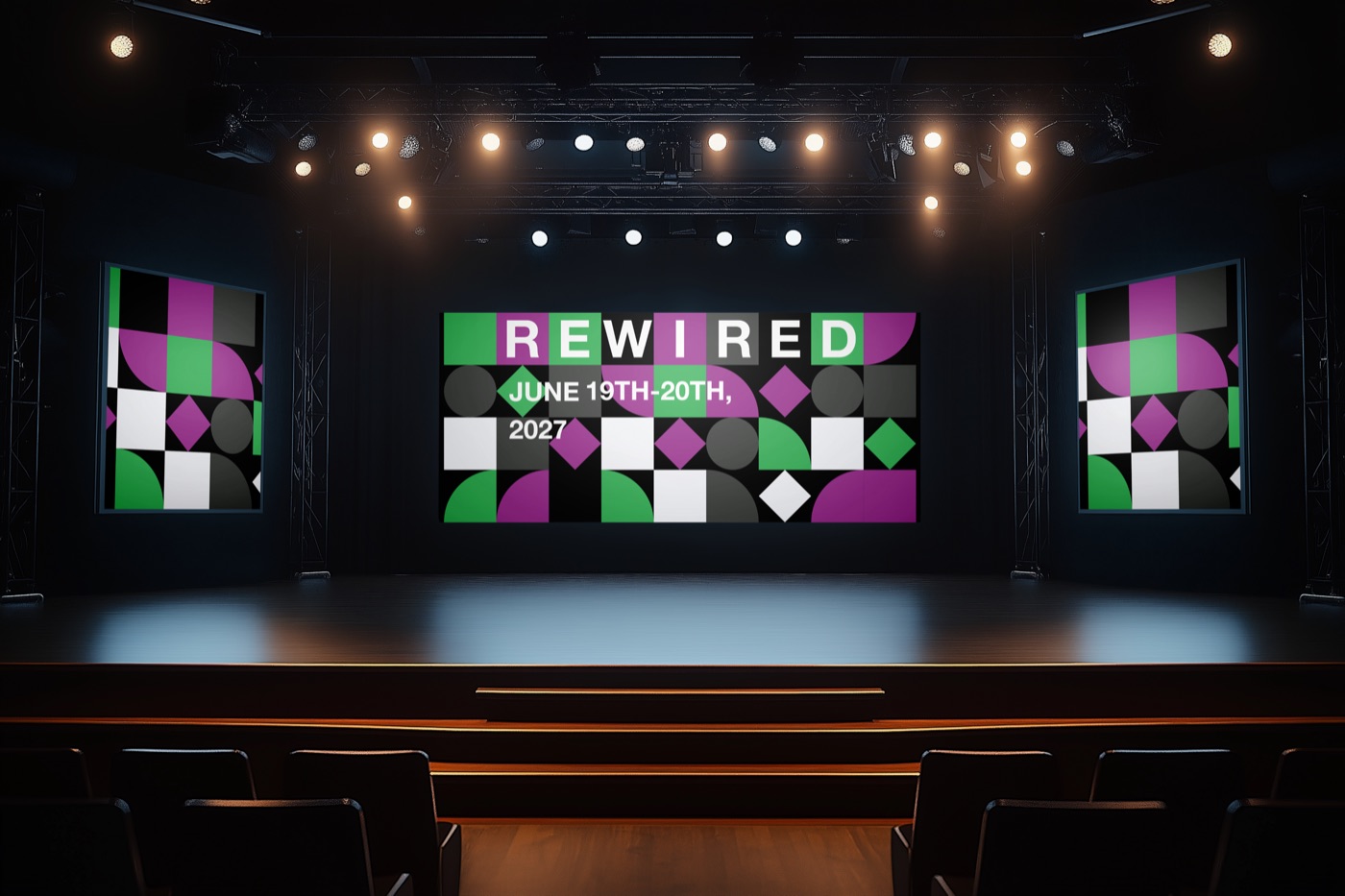
The same shapes and colors carry across a printed brochure, social posts, badges, merch, signage and an animated promo.
11 - What's next
If I had more time.
This was a long, difficult and really fun project. I'd love to make the website the whole project: finish the Schedule page, design a mobile version, and add a second animation.