TCGPlayer
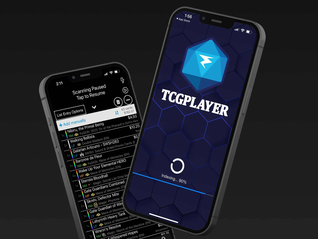
The Most data, but hard to scan.
UX/UI CASE STUDY - 2026
One app to find, compare, buy and sell Pokemon Cards.
01 - The problem
Collectors check several sites to find the best price on a card, and the biggest one, TCGPlayer, packs in so much information that it’s hard to read at a glance. The brief asked for a live market tracker that alerts users to deals without feeling like spam.
02 - Research
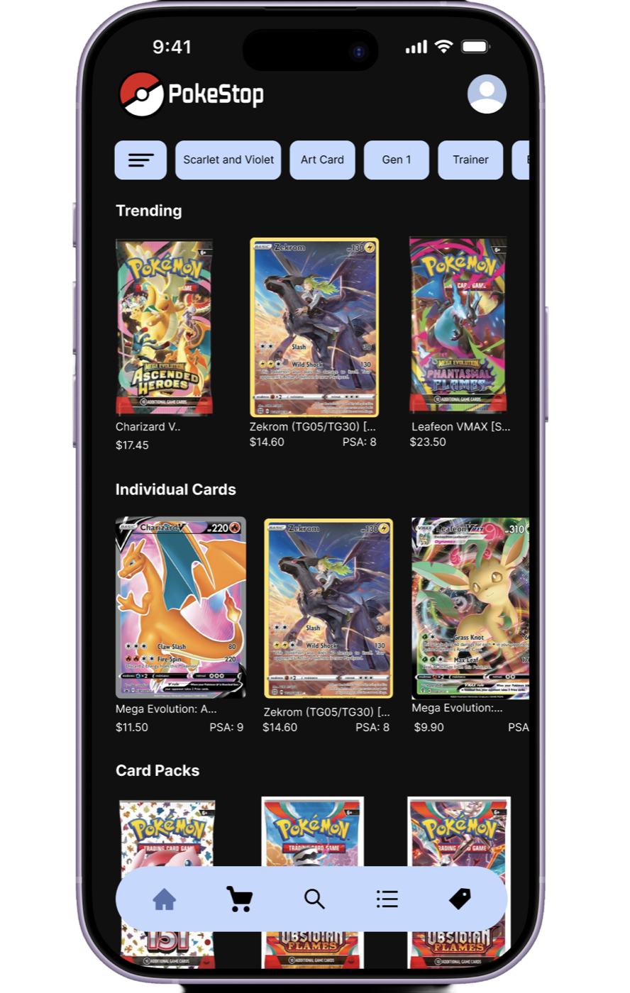
I focused on Pokémon cards only, and on enthusiasts rather than scalpers.
The Most data, but hard to scan.
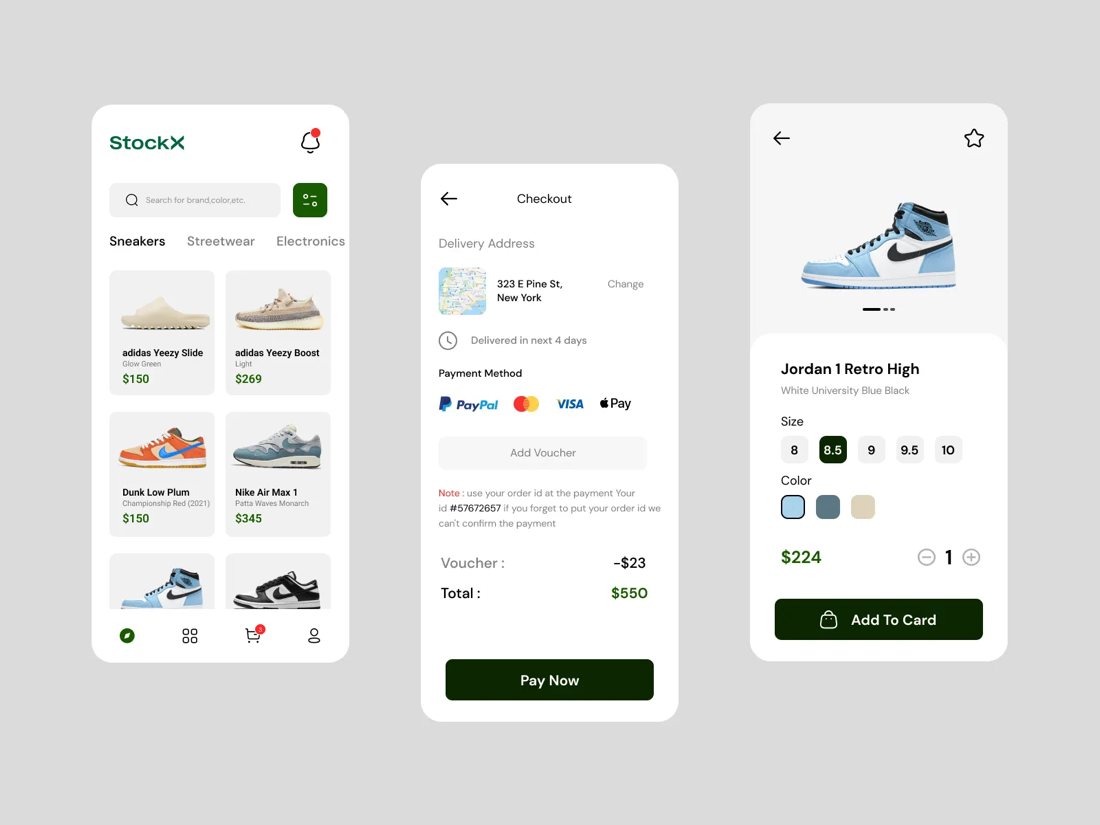
Far easier to read at a glance.
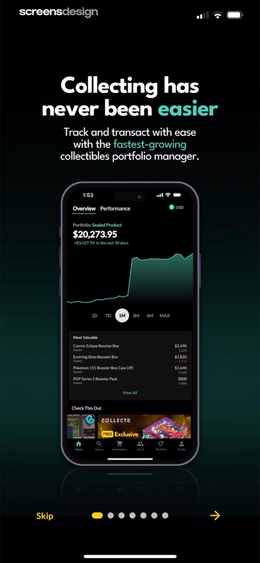
Bare-bones, but I want to build on it.
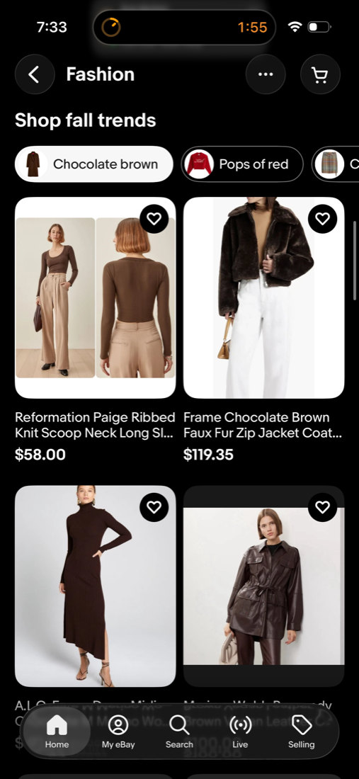
Everyone knows eBay, a great entry point for sellers.
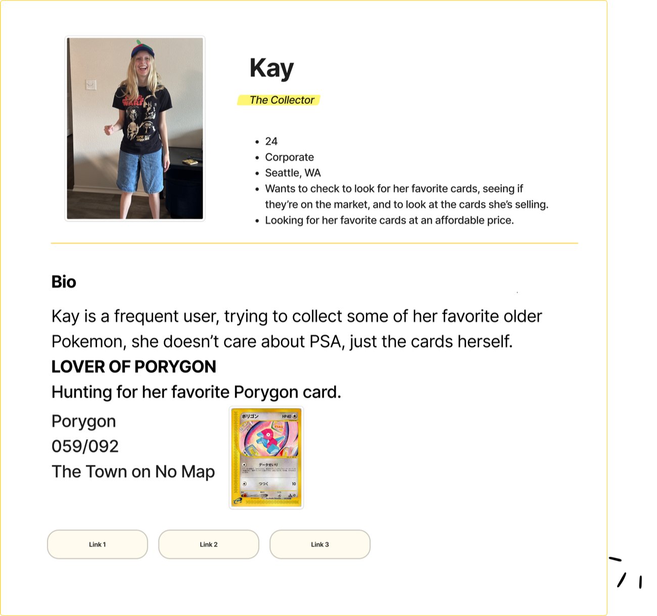
03 - Meet Kay
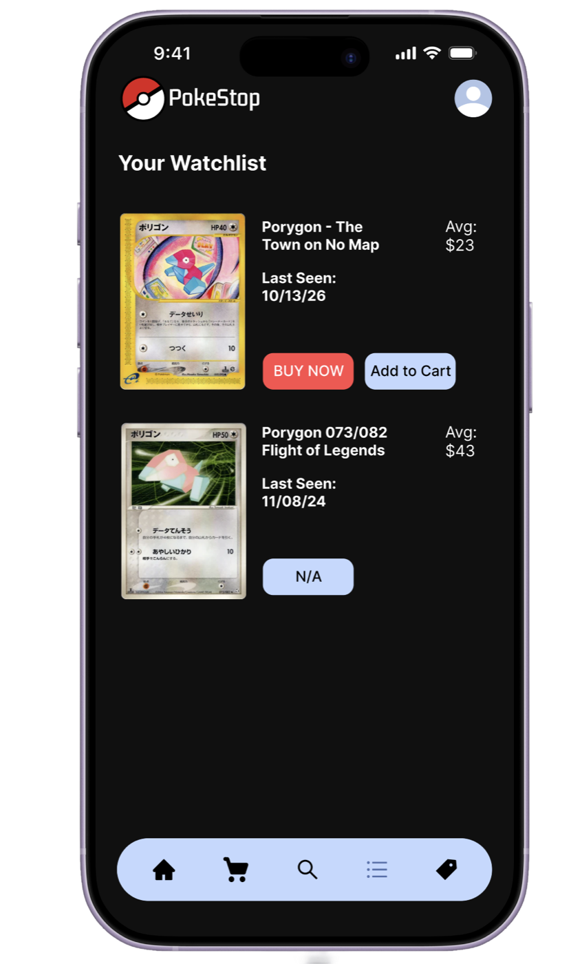
Kay, 24, collects her favorite older cards and is hunting a specific Porygon. She wants one app, one purchase, and information she can read at a glance.
04 - The flow, and the detour
Kay gets an alert, compares sellers, and checks out. But when she doesn’t have enough money, she sells her Rowlet inside the app, then buys the next cheapest Porygon.
Happy path
 Open Watchlist
Compare 4 sellers
Check out
The detour
List Rowlet
Rowlet Sells
Cheapest card gone
Buy next cheapest
Checked out
05 - The logic
IF price A − price B > fees + shipping
AND card is on watchlist
AND price ≤ Kay’s target
THEN alert
The system

Inter 10
Kdam Thmor Pro 20
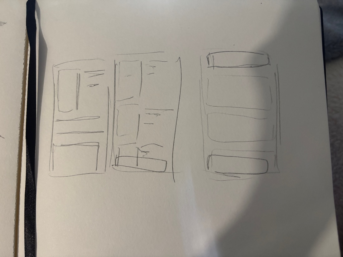
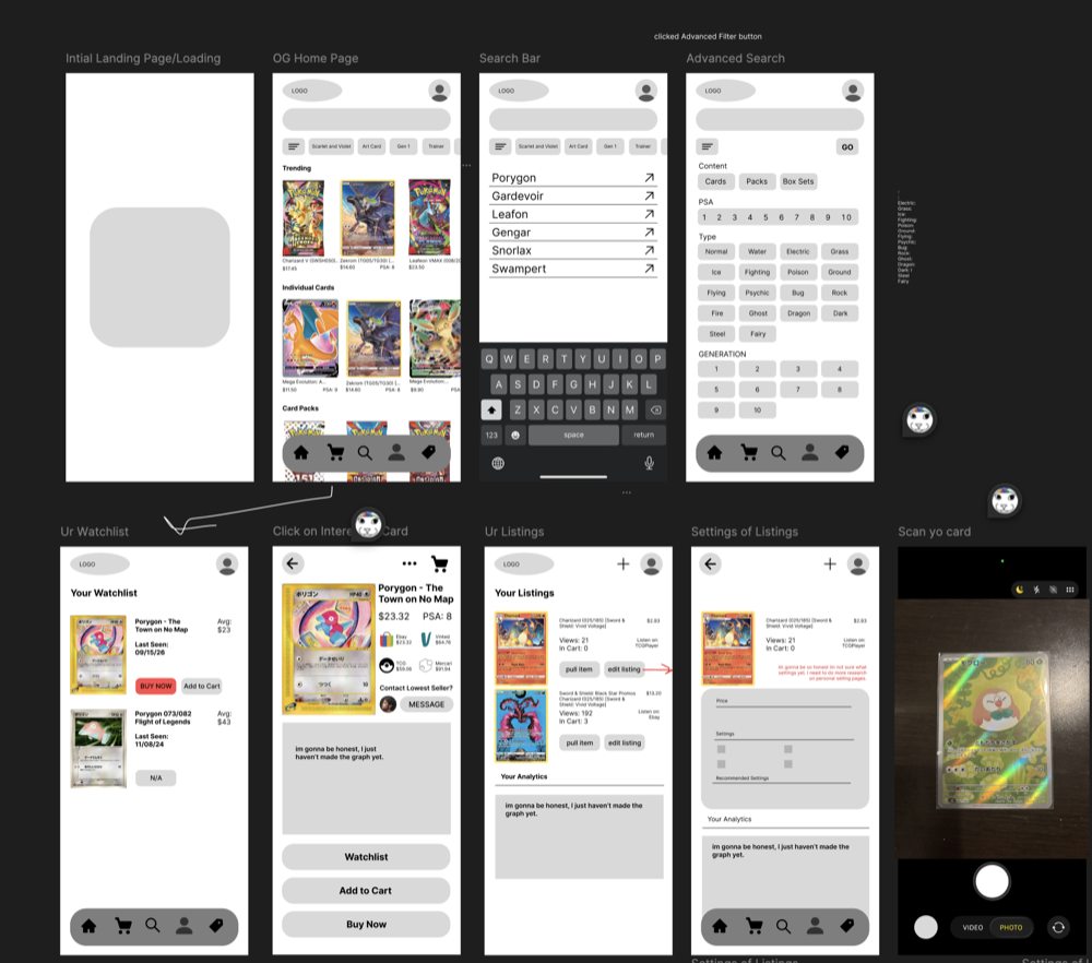
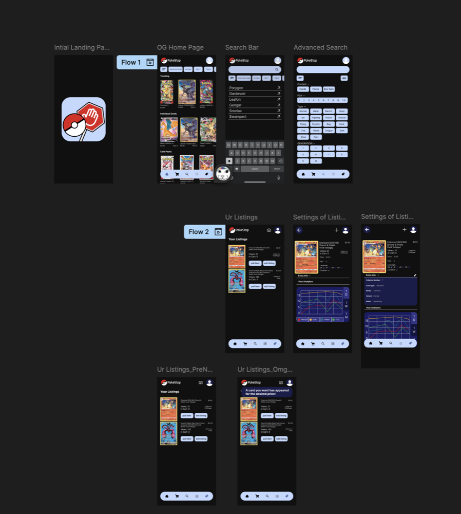
06 - From sketch to screen
07 - Big moment
Alerts only fire for cards on Kay’s watchlist, at a price she set. If she gets a notification, it’s one she asked for.
PokestopA card you want has appeared for the desired price!
PokestopYour Rowlet (082/080) has sold for $5.93!
PokestopError! Not enough money in that account.
08 - Most proud of
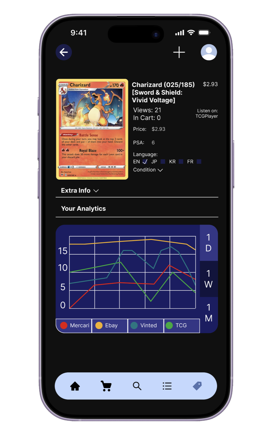
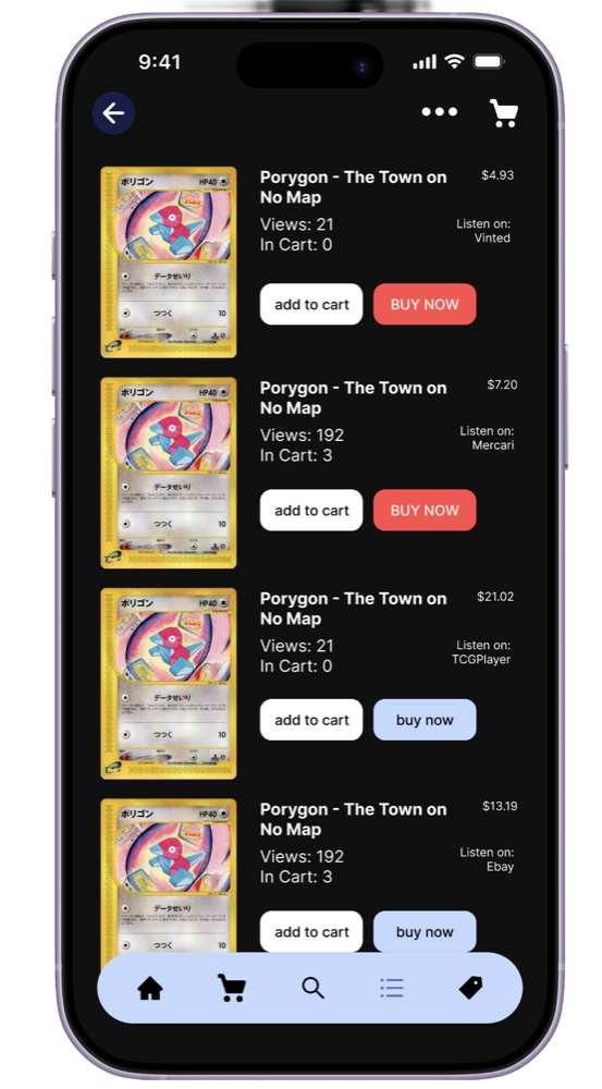
One card, four platforms side by side. The best deal is visible at a glance, with more detail one tap away.
09 - Feedback
BEFORE

Dark blue, contrasts poorly against the background.
AFTER

Lighter blue stands out against the darker interface.
Adding device details made the screens read as a real app.
Critique helped me find the money detour. It took a few rounds, but it became the center of the flow.
10 - What’s next
I’d love to build this out as a full app one day, come back to this project after school, testing it with real collectors, possibly expanding beyond Pokémon.

Conference brand + website